How to Make a Website Attractive: 7 Key Elements to Include
When I started designing, I wanted to learn how to make the most beautiful, attractive websites possible. However, the more I looked at sites for inspiration, the more I found that it was often the unexpected elements of a website that made it attractive to use. If I have to choose from a user experience perspective, I would rather use a functional website than a visually attractive one that is confusing.
Well, as a designer, I would rather both, but the word attractive has now taken on a deeper meaning than simply surface-level beauty. So, due to the subjective nature of the word “attractive,” when describing beauty, we will toss aside stylistic design for the time being and focus on the experience. When we strip away the visual perceptions of attraction, we highlight key features that make a website attractive from a practical user’s point of view.
As a general rule, to make a website attractive and engaging key elements such as readability, graphics, clear navigation, and organization should be included in the design. Including these key website elements increase user interest and engagement.
Websites should be attractive because they help communicate the required messages with customers, increase repeat visit rates, and influence purchasing behaviors. Poorly designed websites have higher bounce rates, meaning people land on a website and leave before exploring more of the site. A poor website design may create a frustrating experience for visitors, negatively impacting the overall brand.
Seven Key Elements That Make a Website Attractive
In an attempt to quantify which design elements create an effective website, in 2016, Renee Garett et al. conducted a literature review. They analyzed 35 of the top research studies covering website design and user engagement to answer this question. This analysis found that the following seven key design elements repeatedly arise.
Ease of Navigation
Websites with high engagement featured a clear navigation system. A clear and consistent navigation system helps users feel in control of their experience. This also makes it easy for the user to find the information they’re looking for without getting frustrated and leaving.

Purpose
At the end of the day, time is precious. Being clear on what you deliver and the benefits you offer the user is crucial to keeping them engaged. A business’s purpose should also be unique; why would someone spend time on your website and opt for your services or products over competitors?
Readability
It is vital a website’s content is readable to ensure effective communication between the business and the user. Readability includes how easy the font is to read on a screen, the font sizes, and not having too much text in a single block. The copy should also be well written, free of grammatical errors, easily understandable, and at an appropriate reading level for the user.
Individual letter designs also determine the readability of a font family. One key factor is whether multi-letter homoglyphs are easily distinguishable. For example, when the letters “r” and “n” sit next to each other in a word, do they look like their parts “rn,“ or could they easily be mistaken for an “m.”
Common multi-letter homoglyphs
- rn vs. m
- cl vs. d
- cj vs. g
- vv vs. w
10 Great Fonts for Accessibility & Display Readability
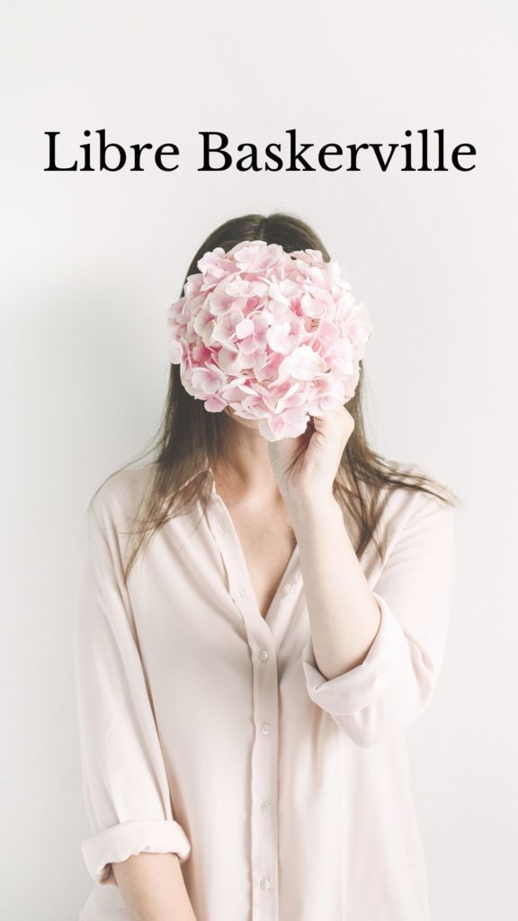
- Libre Baskerville
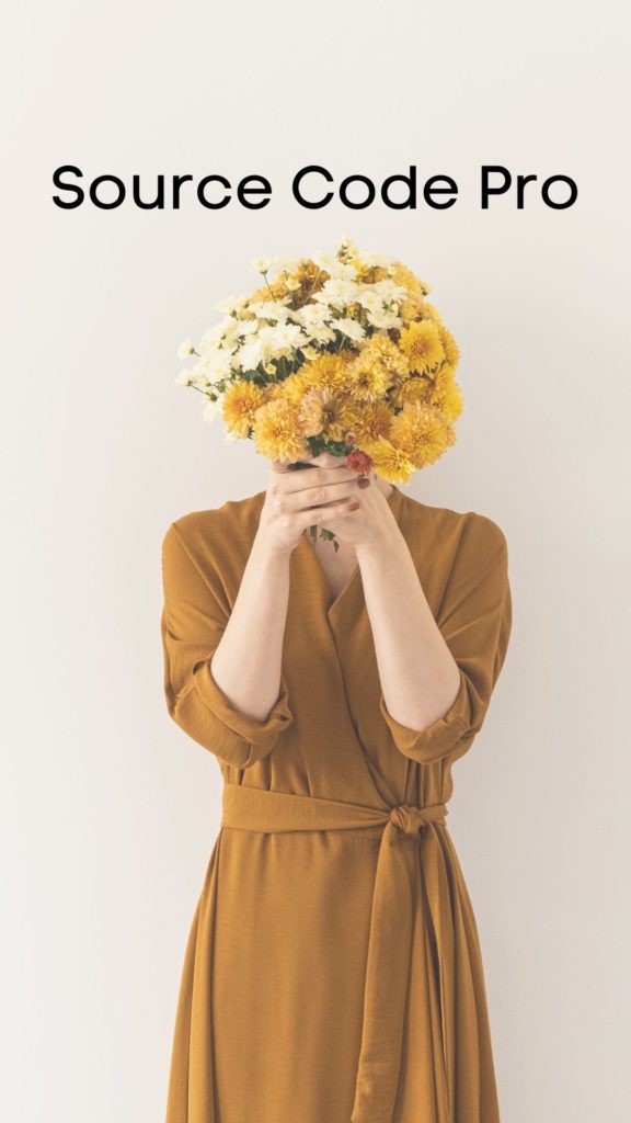
- Source Code Pro
- Poly
- K2D
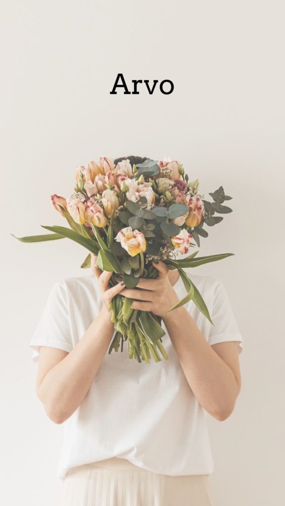
- Arvo
- Ubuntu
- Arbutus Slab
- Podkova
- Fira Code
- Arima Madurai
Simplicity
From a user perspective, simplicity relates to how easy it is to navigate and not be filled with redundant features. For example, a website with intricate graphical elements can still tick the simplicity factor if the user experience offers a clear path to follow so they can get the information they need, such as keeping call-to-action (CTA) statements consistent across the site. Rather than asking them to take ten or so different actions, pick one or two and repeat them.
Information should also be transparent to the reader. It shouldn’t be complex or obscure what the message is you’re trying to communicate. Headings that are straight to the point help the user navigate the site.
Another aspect of simplicity is providing sufficient white space, so the layout is uncluttered. White space is areas of the page without text or pictures. Ensuring adequate space between elements gives the user time to process and breathe before they reach the next set of information.
Use of Graphics
Including graphics is a vital component of making a website attractive. Regardless of their style, they should be sized appropriately with a quality resolution. The logos and icons used should be distinct and uniform across the website.
Color schemes should be consistent across the site. When using fonts with color, they should be of high contrast to be easily readable. A color theory should be applied when choosing a palette to maximize the website’s attractiveness.
It is also vital that images, videos, and animations size are optimized for websites so that they load quickly and efficiently without slowing down the website. If a website doesn’t load quickly enough, it can result in people giving up, bouncing, and trying another site.
Read More: 7 Reasons Why Websites Should Be Attractive
Organization
The organization focuses more on the structural layout of a page and website. Basically, does it make sense? Is the structure logical and meaningful?
This includes things like sequencing and a clear text hierarchy, such as headers being larger than subheaders and body text. Is the information arranged using an understandable structure and categories, and is this consistent across the site? Are keywords used to highlight the organization for the viewer?
One more critical now than ever is having a website with an optimized design and organization on different devices. More people are using their cell phones to browse the internet than before, so it is crucial to have a system that works across screens.
Content Utility
The content utility of a site is a big one for increasing engagement as it keeps people active on the site and encourages return visitors. For example, if your website features minimal content that’s rarely updated with new information or events, what reason does the user have to return? If a site has out-of-date content, the user will quickly leave searching for something relevant.
It is not enough to have a large volume of content, however. To keep the content utility score high, the viewer must deem it relevant to the website’s purpose. Think about it, if you’re on a financial services site scrolling their blog for mortgage advice and suddenly come across an article on pet grooming or celebrity gossip, you’re probably going to question their expertise when it comes to finances and search elsewhere.
Lastly, it’s one thing to have an attractive site and another to have a unique website that stands out in a crowd. Taking your design one step further and turning it into a truly unique website will help enhance user memorability and encourage more return visits.

Adrianne Jerrett is a yoga-loving self-awareness writer and the founder of Jerrett Digital, a brand identity and design company that creates bold Showit websites for health and wellness professionals and ethical businesses. She helps overwhelmed entrepreneurs shift to being aligned and confident experts, ready to grow their businesses online and boost their positive impact.
Aug 5, 2022
Leave a Reply
Sign up to my monthly newsletter to receive this step-by-step workbook guiding you how to strategically select your brand colors like a pro.
Plus features a bonus section on tips for choosing fonts!
Download The "How To Choose Your Brand Colors Like a Designer" Workbook for FREE!
Your message has been sent!
Thank you for applying to have your website audited, I'll get back to you ASAP. Have a beautiful rest of your day.
DIY Templates
Get started & get beautiful
Template Customization
Get up and running FAST
Custom Website
Tailor-made for you
Shop Templates
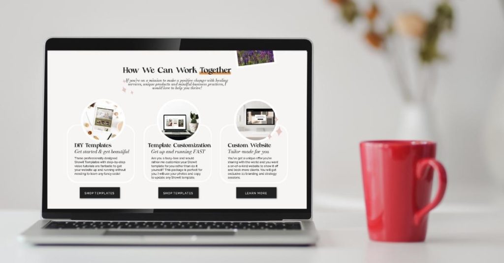
How We Can Work Together
If you’re on a mission to make a positive change with healing services, unique products and mindful business practices, I would love to help you thrive!
Shop Templates
Learn More
Adrianne captured the essence of who we are and what we are about!
Adrianne designed and created our website and really captured the essence of who we are and what we are about. We were thrilled with the outcome and would not hesitate to highly recommend her to anyone wanting a professional, well thought out website. Her attention to detail was fantastic and her wording was perfect.
Lydia & jess
Apex Accounting
I feel so lucky to have found Adrianne
I feel so lucky to have found Adrianne! Her creativity has taken my designs to a whole new level. Adrianne is so professional. She is constantly learning and making sure she's on top of the latest recommendations. I only provide a little guidance and input and Adrianne does what needs to be done. You will love working with Adrianne!
Juli
Radiant Shenti
She has a creative flair and analytical mind—a rare combination
Adrianne is incredibly well-rounded and great as a support for the detail and strategy. She helped me build some beautiful funnels and run an online global retreat. She has a creative flair and the analytical mind- a rare combination. She can work with you at the high level strategic arm of your business and knows the actions for how to make it happen. I would highly recommend her for funnel building, strategy support, website updating, content writing and design.
Raphael
Empowered with Raphael
Want a Free Website Audit?
Get free advice and tips on how to make your website homepage more user-friendly from a professional website designer.
Apply today
Please fill out the form and I'll make you a short video with tips on how to up-level your website and make it more user-friendly.
Get Your Website Audited for FREE!
Send
Instagram Handle
Tiktok Handle
Website URL
Your email
Your name
Your message has been sent!
Thank you for applying to have your website audited, I'll get back to you ASAP. Have a beautiful rest of your day.
Sign-Up to Get 15% Off Our Showit Website Templates!
Plus as a newsletter subscriber you will get tips and tricks for how to make the most of your website to grow your business sustainably.
Unsubscribe at any time. Read our full privacy policy here.
Leave a Comment